Landing pages
Overview
MessageGears Landing pages are dedicated, standalone web pages for driving engagement, boosting customer acquisition, and grab customer's attention. They are instrumental to brand growth through personalized experiences originating from all marketing channels. Pages are purpose-built for converting a customer's attention into a successful outcome.
Landing pages are accessed via the Customer Hub. Contact your CSM for more details or to add Landing pages to your account.
Quick actions
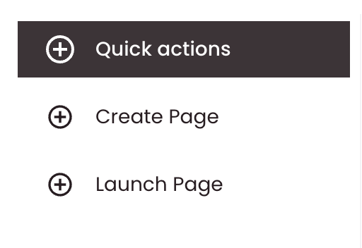
Click the plus button at the top of the left navigation to open the create menu. You’ll see two options:
- Create Page – Start a new Page Builder page (name, description, and starting content).
- Launch Page – Create or manage content that is launched (goes live) for campaigns.
These quick actions link the user straight to the appropriate menus for performing these tasks.
Page builder
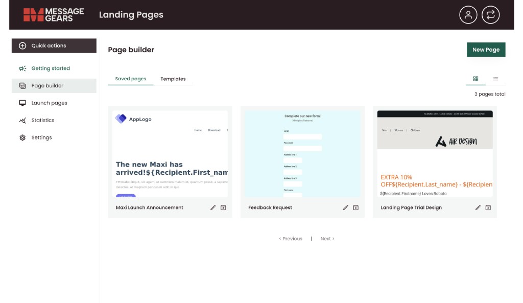
Page builder is where you work with saved page designs and page templates. From here, users can access:
- New Page: Opens the Create page builder
- Saved pages: View a list of pages you’ve built and saved. Each entry can show:
- A thumbnail preview.
- Title and description.
- Last modified date/time.
- Templates: Switch to the Templates tab to see and use templates for creating new landing pages.
Templates
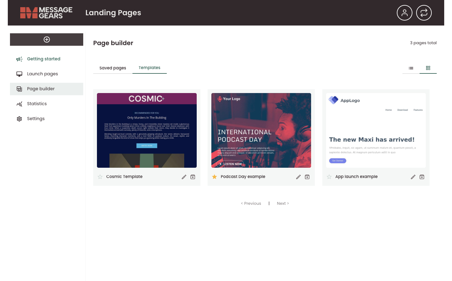
On the Templates tab, each template is shown as a card with a preview and title. For any template you can use the buttons on that card to manage it:
- Star (favorite) – Click the star icon to star (favorite) a template so it’s easy to find, or click again to remove the star. A filled star means the template is tagged as a favorite.
- Edit – Click the pencil icon to open the template in the editor and make changes.
- Archive – Click the archive icon to archive the template so it’s no longer in the active list (archived templates can typically be restored later if needed).
Create a new page
Create Page is used to create drag-and-drop pages using the visual builder. To upload HTML pages, use the Launch Page option.
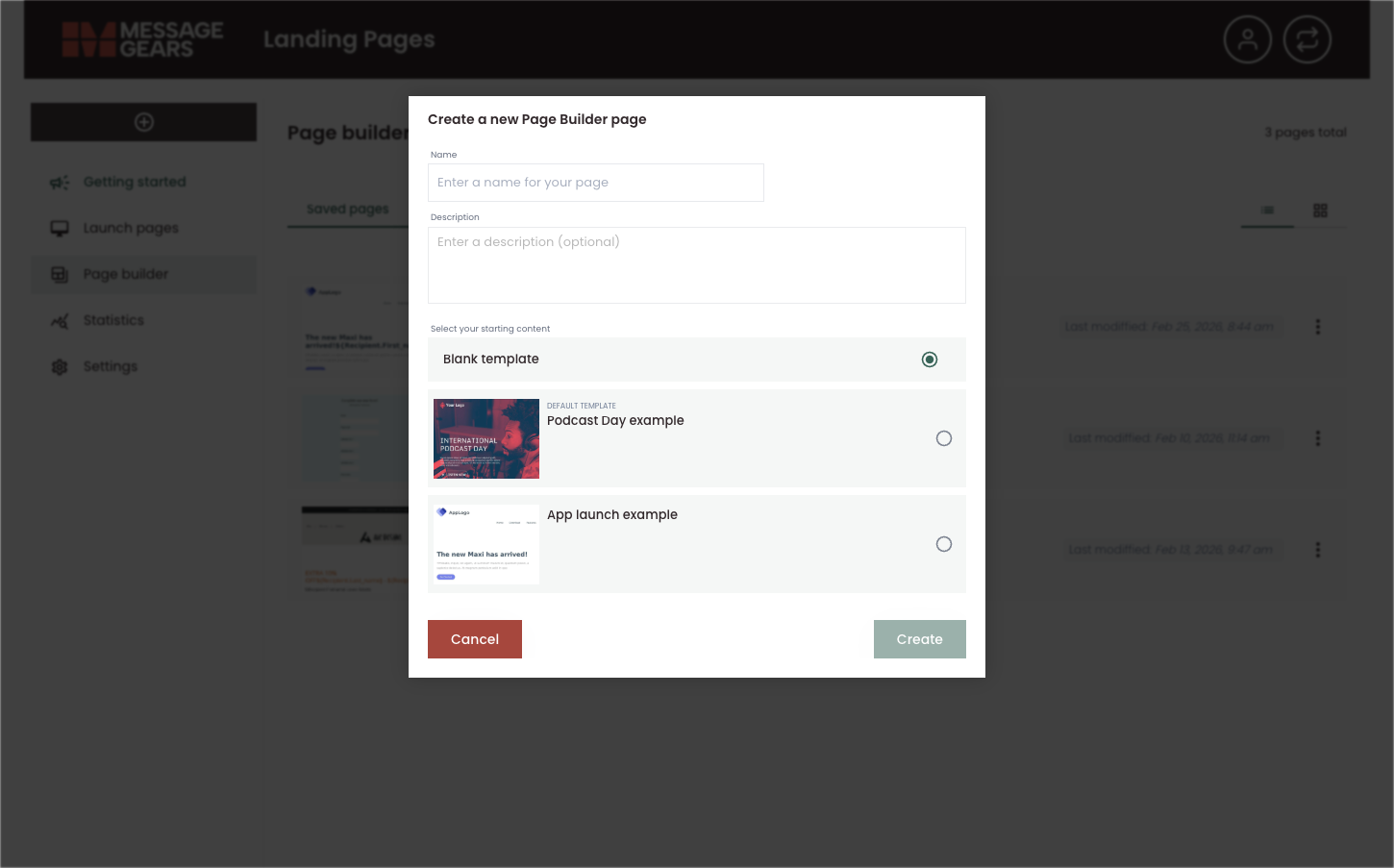
Choosing Create Page opens the Create a new Page Builder page window. Use it to define your new page and how it’s built:
- Name – Enter a name for your page in the Name field (e.g. “Summer promo landing page”). This is required.
- Description – Optionally enter a description in the Description field to document the page’s purpose or audience. This is for your reference and does not appear on the live page.
- Select your starting content – Choose how the page is created:
- Blank template – Build the page from scratch. No pre-existing layout or content is added. You add rows and content blocks in the drag-and-drop editor after creation.
- Pre-existing template – Select one of your pre-built templates to start from that design. Each option shows a thumbnail so you can pick a layout that fits your campaign. You can then edit the template in the page editor.
When you’re done, click Create to open the new page in the editor, or Cancel to close the dialog without creating a page.
Visual page builder
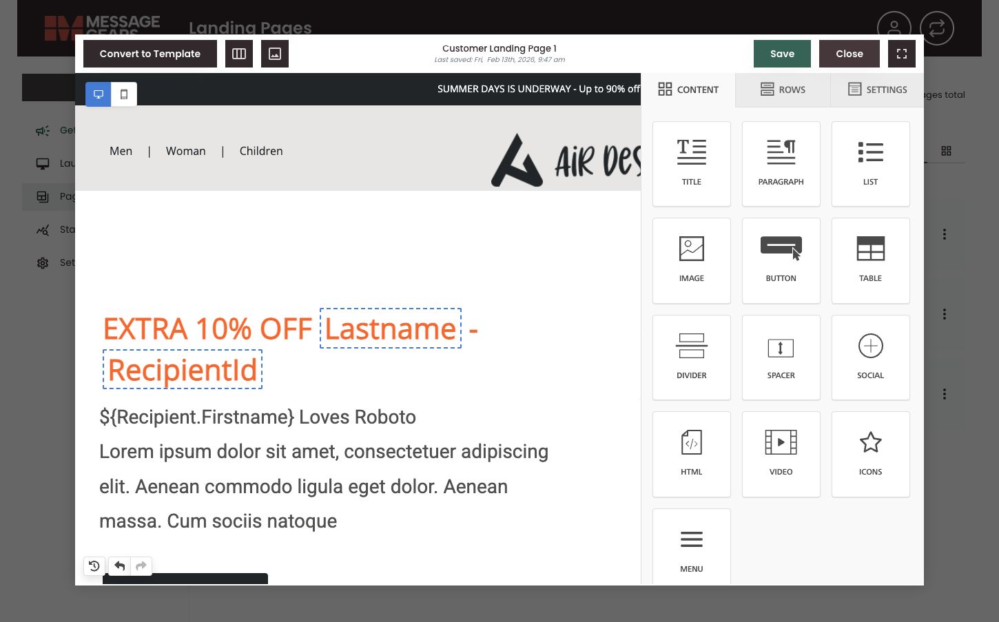
Clicking Edit on a saved page or template opens the visual drag-and-drop page builder. The editor gives you a live canvas and control panel so you can build and adjust the page using a variety of content blocks and styling elements.
Content blocks
The Content panel lists blocks you can drag onto the page, including:
- Title, Paragraph, List – Text and list content
- Image, Button, Table – Media and interactive elements
- Divider, Spacer – Layout and spacing
- Social – Social media links or buttons
- HTML – Custom HTML snippets
- Video, Icons, Menu – Video embeds, icon sets, and navigation menus
Drag a block onto the canvas to add it. You can then select it to edit text, swap images, or change styles. Merge tags (e.g. recipient first name, last name) can be used in text so content is personalized when the page is viewed.
Rows and layout
The Rows panel lets you control the structure of the page. Add rows and choose column layouts (e.g. one column, two columns, sidebar) so content is organized in sections. Rows define the high-level layout, and content blocks sit inside the row columns.
Settings
The Settings panel provides page-level options, such as content area width, page background colors and images, page metadata, and other global settings for the landing page. Use it to configure behavior that applies to the whole page.
Test and preview the page
- Convert to template – Save the current page as a reusable template so it appears in the Templates tab and can be used as a starting point for new pages.
- Preview – Click the preview button (picture-frame icon in the editor header) to open preview mode. Preview mode lets you see how the page will look before saving or launching. You can switch between light and dark mode to check appearance in both themes, and choose different resolutions and device form-factors—such as PC (desktop), tablet, and phone—so you can verify layout and content across screen sizes. Use these options to confirm that merge tags and styling look correct on each device type.

The fullscreen toggle expands the editing area for more visual real estate during the design process.
Launch pages
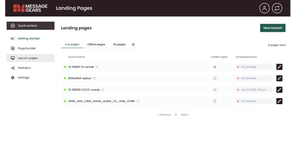
Launch pages shows all landing pages that are launched (live), offline, or both, depending on the selected filter. Here, you can:
- Launch a new page
- Filter by status: Use the Live pages, Offline pages, and All pages tabs to limit the list.
- Review page details: Each row shows:
- A status indicator (for example, a green dot for live).
- Page name/ID.
- Content types indicating which types have been configured for the page (visual builder vs HTML, iOS, Android, error content)
- Schedule information (e.g. “No schedule” or a scheduled take-down date/time).
- Edit action (pencil icon) to open the page for editing.
Launch a new page
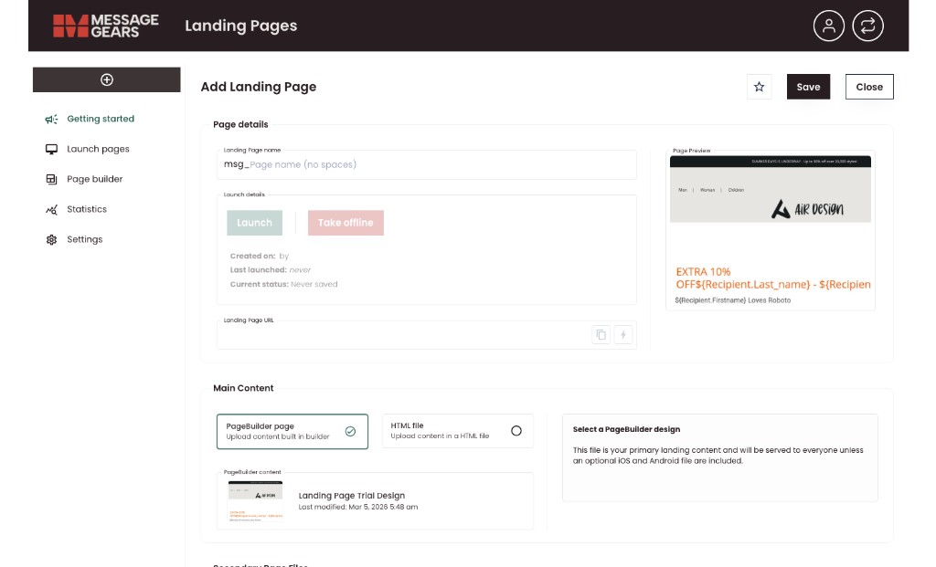
The New Launch button opens the Add Landing Page page. Use it to create and launch a new landing page: set page details, choose or build the main content, optionally add device-specific or error pages, schedule when the page goes live and is taken down, and review history. Buttons at the top let you Save (save without launching), Close (exit), Launch (go live), or Take offline, and you can Copy preview version or Copy email version for sharing or use in emails.
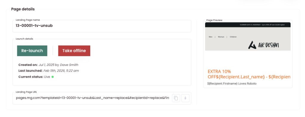
Step 1: Page details
Enter a Page name with no spaces. This identifier is used in the Hub and in URLs or links to the landing page. For an existing page, the section shows Launch details with:
- Re-launch and Take offline buttons
- Re-launch will replace the existing live page content with any updated content from the page selected in Main Content
- Created on and Last launched (with who created it)
- Current status (e.g. Live, with a green indicator)
The Landing Page URL is shown in a read-only field with copy and quick-access icons. This will auto-generate after clicking Save on the new Content Launch.
A Page Preview on the right displays a thumbnail of the page content. Fill in any other page-level fields so the page is correctly named and described for your team and for reporting.
Step 2: Main content
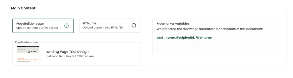
In the Main content section you can choose PageBuilder page (content built in the visual builder) or HTML file (upload an HTML file).
When PageBuilder page is selected, the PageBuilder content area shows the chosen page with a thumbnail, page name, and last modified date.
A FreeMarker variables panel lists the placeholders detected in the document (e.g. Last_name, RecipientId, Firstname) for personalization. The selected page is what most visitors see. If you don’t add optional device-specific files (see below), this content is served to everyone.
Step 3: Secondary page files
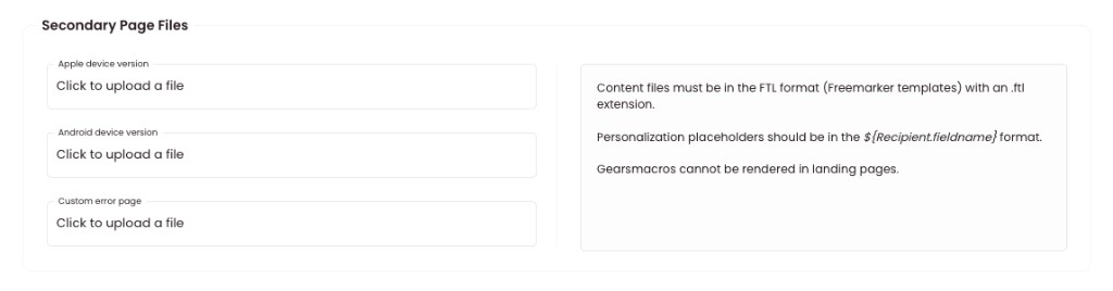
You can optionally add separate files for specific mobile devices and for errors:
- Apple device version – Upload a file to serve a custom version of the landing page to users on Apple devices (e.g. iPhone, iPad). Use this when you need different layout or content for iOS.
- Android device version – Upload a file to serve a custom version for Android devices. Use this when you need a different experience on Android.
- Custom error page – Upload a file to show when an error occurs (e.g. when the main page cannot be loaded). This gives users a branded or helpful error experience instead of a generic message.
Content files must be in FTL format (FreeMarker templates) with an .ftl extension. Use personalization placeholders in the form ${Recipient.fieldname}. The panel next to these fields summarizes format and personalization requirements.
Gears macros cannot be rendered in landing pages.
Step 4: Schedule and Launch
Set when the landing page is active:
- Go live date – Date and time when the page becomes available. Use the date picker and time field to set the go-live moment.
- Take-down date – Date and time when the page is automatically taken offline. After this time, the page will no longer be served. Use the date picker and time field to set the take-down moment.
Leaving the take-down date blank means the page stays live until you manually take it offline.
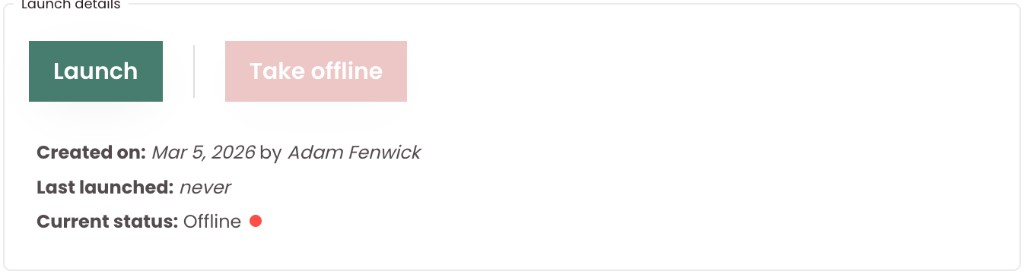
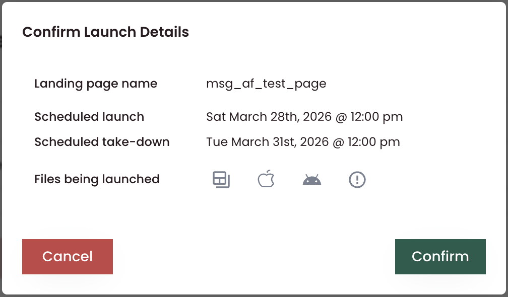
Clicking the Save changes button will only save the configuration changes, but will not launch the page. You must click through the Launch button to activate the page and set schedule.
Click the Launch button to view the launch details, and click Confirm to activate the schedule and set the page the live. The Current status will update to reflect the changes.
Page History
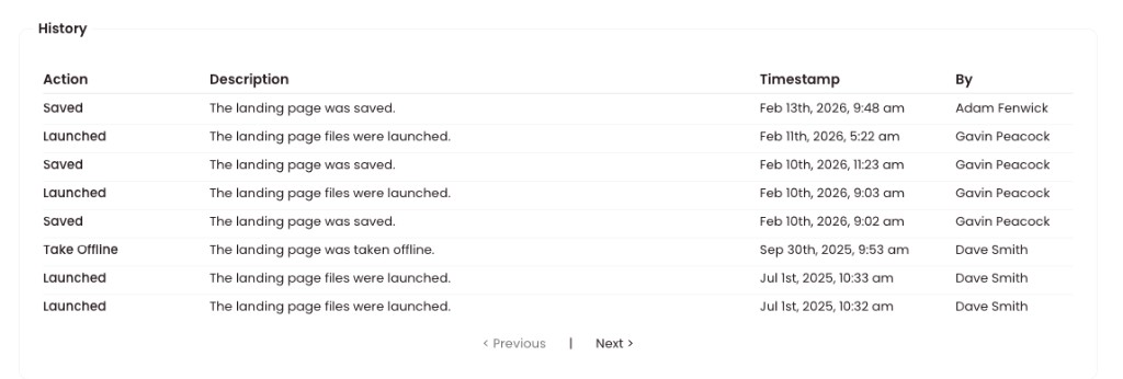
The History section shows a log of actions for this landing page. History helps you audit changes, launches, and take-downs.
- Action (e.g. Saved, Launched, Take Offline)
- Description (e.g. “The landing page was saved.”, “The landing page files were launched.”)
- Timestamp
- By (the user who performed the action)
Statistics
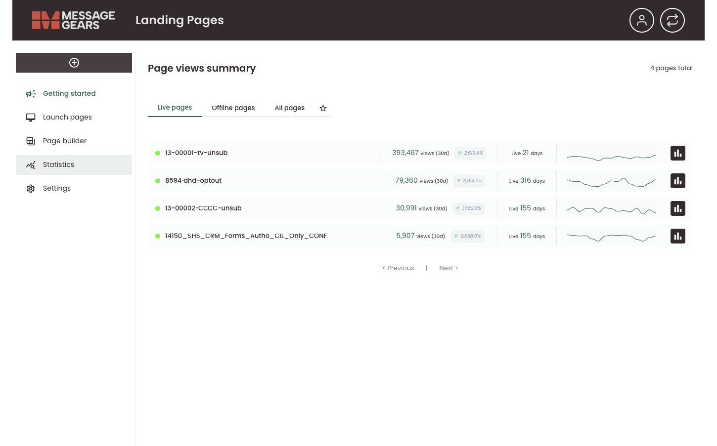
Statistics shows the Page views summary: how often your landing pages are being viewed.
What you can do here:
- Filter by status: Use Live pages, Offline pages, or All pages (and the star icon if it denotes a special filter) to scope the list.
- Review metrics: For each page you can see:
- Views (30d) – Number of views in the last 30 days and percentage change (e.g. ↑2,619.4%).
- Live duration – How many days the page has been live.
- A small trend graph for view activity over time.
- Drill down: Click the bar-chart icon on the right side of a row to open Page views for that specific landing page.

Actions and options:
- Use Previous / Next (and page numbers) to move through the list when you have many pages.
Page views for a specific page
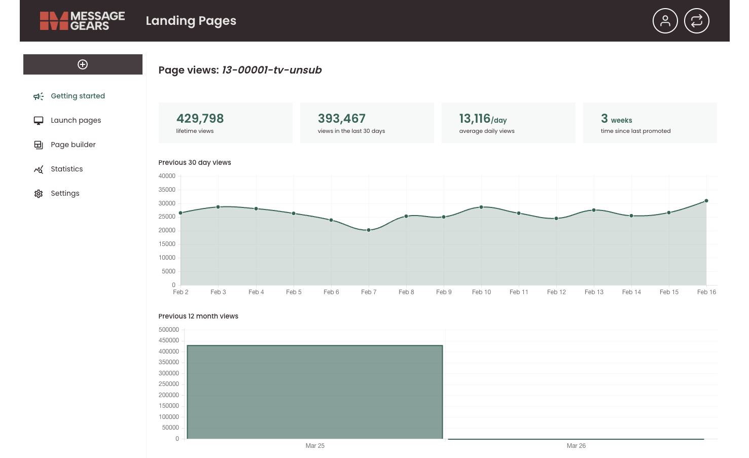
Clicking the bar-chart icon on a Statistics row opens the Page views screen for that landing page. The page title appears in the sub-header, and the content shows detailed analytics for that page only.
Summary metrics
At the top, four metrics give a quick overview:
- Lifetime views – Total views since the page was created.
- Views in the last 30 days – Views over the past 30 days.
- Average daily views – Average views per day over the selected or default period.
- Time since last promoted – How long it has been since the page was last promoted (if applicable).
Previous 30 day views
A line chart (with shaded area) shows daily view counts for the previous 30 days. Use it to see day-by-day trends, spikes, or drops in traffic.
Previous 12 month views
A bar chart shows view counts by month over the previous 12 months. Use it to compare monthly performance and spot seasonal or long-term trends.
Together, these views help you evaluate how a specific landing page is performing and decide whether to update content, adjust promotion, or take the page offline.
Settings
Settings is only available to administrators. Contact your CSM for regarding any configuration setup in this area.
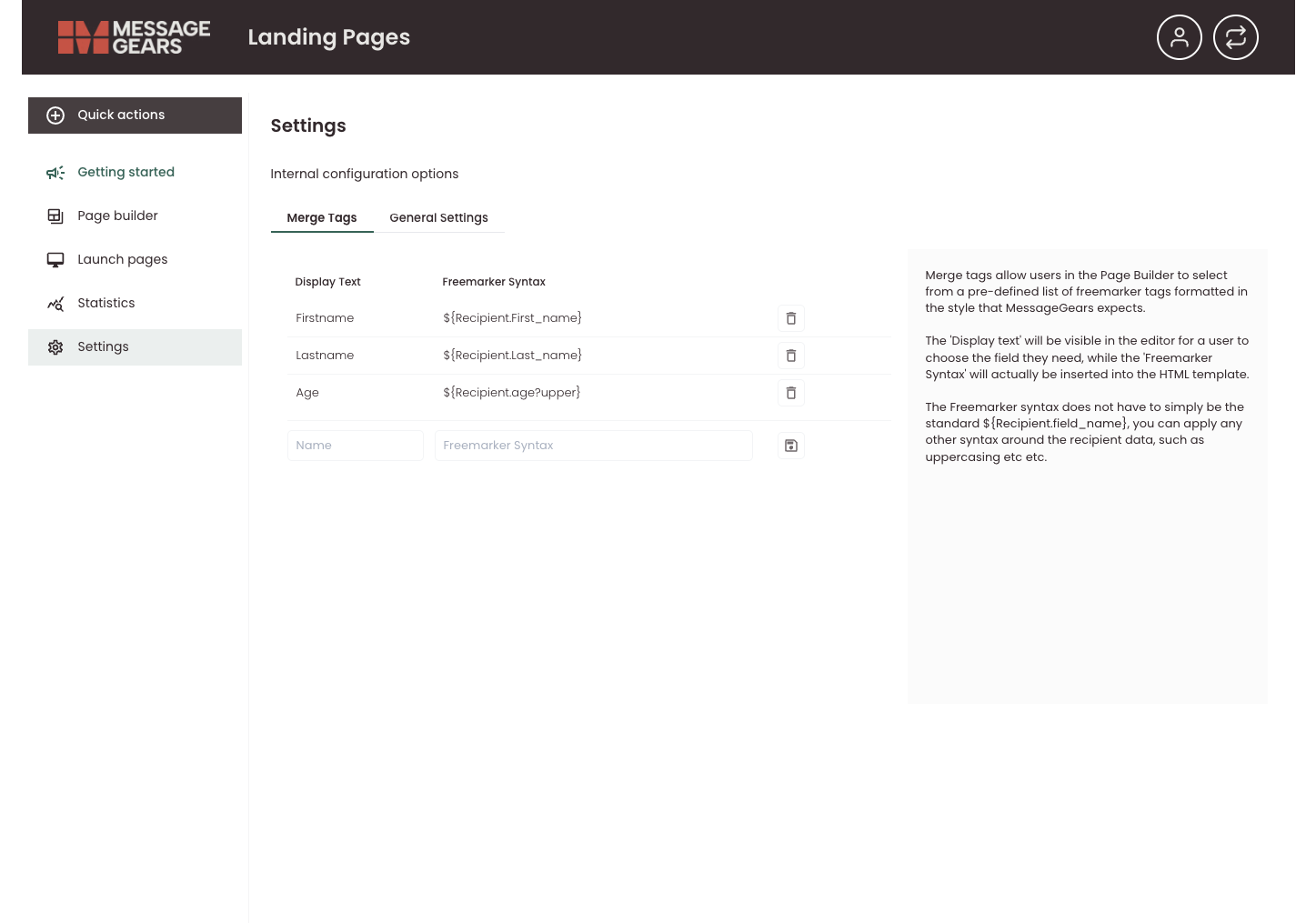
Settings holds internal configuration options for landing pages. It is organized into tabs: Merge Tags, and General Settings.
What you can do here:
- Merge Tags (tab): Define merge tags that appear in the Page builder so authors can insert recipient or other data into landing page content.
- Display text – Label shown in the editor (e.g. “Firstname”, “Lastname”, “Age”).
- FreeMarker syntax – The actual snippet inserted into the HTML template (e.g.
${Recipient.First_name}). - You can add new variables (name + FreeMarker syntax) and remove existing ones (e.g. via the trash icon). The panel on the right explains how display text and FreeMarker syntax work together.
- General Settings (tab): Adjust other landing-page-wide settings.
Merge Tags
Merge tags allow Page builder users to choose from a predefined list of FreeMarker tags in the format MessageGears expects. Display text is what they see in the editor, while the FreeMarker syntax is what gets inserted into the template, and can include built-in formatting parameters (such as ?capitalize for proper case for names).
New merge tags must be configured here to appear in the personalization helper dropdown for selection when building a new page through the visual editor.